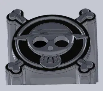
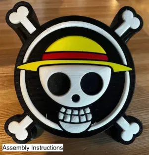
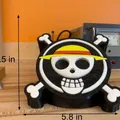
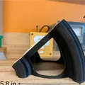
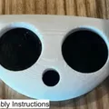
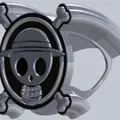
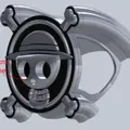
One Piece Logo Display

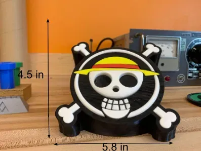
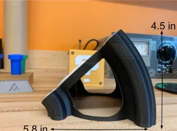
Màn hình/câu đố logo một mảnh, có kích thước 5,8 inch x 5,8in x 4,5in. Hiển thị hoàn hảo cho người hâm mộ anime!


Mô tả
Summary
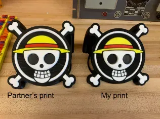
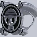
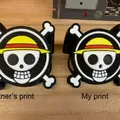
A One Piece Logo display/puzzle, measuring 5.8in x 5.8in x 4.5in. Piece together the hit one piece logo and display in the accompanying stand. Perfect display piece for One Piece and anime fans and for any collector of anime memorabilia. This piece was designed in my school's Engineering and Design course where me and my partner -link page here- were tasked with adapting a two dimensional artwork to a three dimensional display format.
Lesson Plan
With a partner design a “2D” placard using Solidworks modeling software. You and your partner will have the same design which meets the constraints below, and you will EACH use Solidworks to create your design.
- Should have a flat back ; detail will be on the front side
- Should fit inside a box that is no bigger than 225cm2 in area with no dimension longer than 25cm
- When assembled, it should be no more than 1cm in total thickness.
- Sketch must begin with a constraint box,center-rectangle created from the origin)
- Dimensions should be detailed but efficient
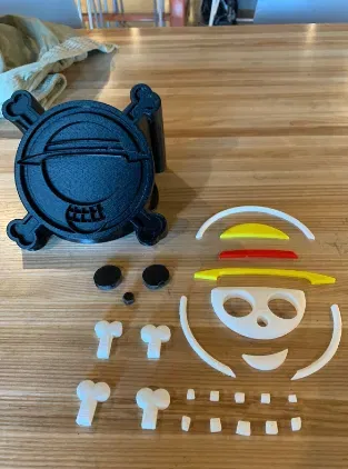
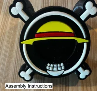
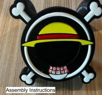
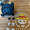
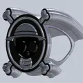
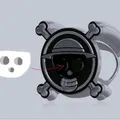
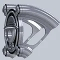
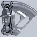
Assembly
- Press all pieces into their fitting sockets in the base, bar the eyes and nose pieces.
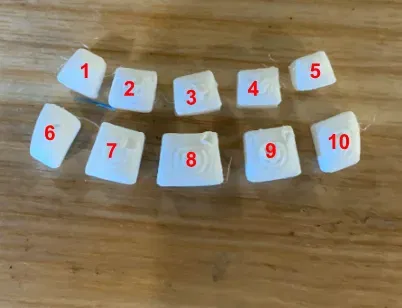
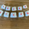
- Make sure to press the teeth numbered 1-10 in their respected spots
- Insert the eye and nose pieces into their respective sockets in the face piece.
- Place the face-eye-nose combination into its socket in the base
Design Choices
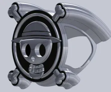
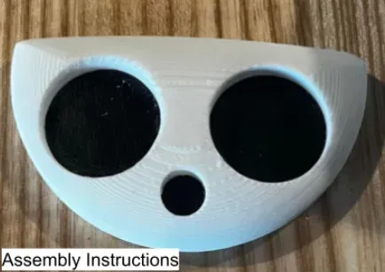
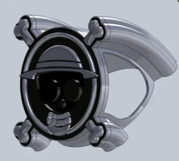
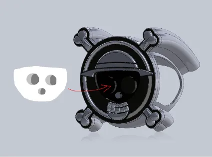
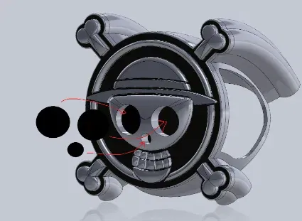
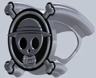
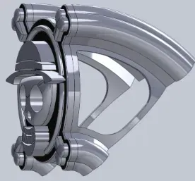
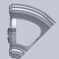
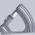
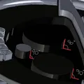
Our first design choice was to separate the eyes of the logo from the base. In our original concepts, the base of the logo with all the pieces put in except for the face piece looked like this (see picture 15) . The original construction process was: Put in all the pieces, then put in the face piece on top of the eyes and nose pieces which were pre-connected to the base (see picture 16). But we learned that this design of “having the eyes and nose pieces pre-attached” would form sharp right angles when 3d printed, which were susceptible to snapping during printing or during assembly (see picture 17). And so, to avoid our eyes and nose pieces snapping off, we opted to have them separate from the base and for them to be put into the face piece during assembly (see picture 18). This change made no noticeable visual difference, but without it our project would not be able to be assembled and disassembled without breaking.
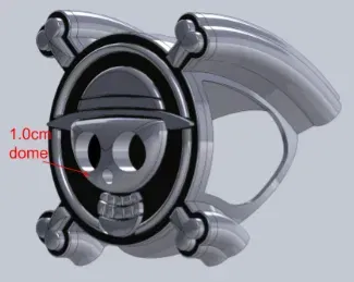
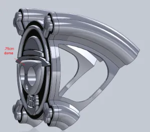
Our next couple design choices were different iterations of our face, teeth, and jaw pieces. Our first iteration of the pieces looked a little flat (see picture 19). To solve this problem we decided to add a 1.00cm dome feature to the face piece (see picture 20). Which from a side view looks like this (see picture 21). This dome was now sticking out too far. So to balance out the heights of the pieces in our logo a bit, we decided to bring the surrounding teeth, jaw, and hat pieces up to the face piece’s height, which looked like this (see picture 22). This iteration looked even more uneven now! We finally decided to set the heights of the hat, teeth, and jaw pieces back to their original heights, and to simply decrease the height of the face’s dome feature to .75cm (see picture 23). And with that design choice we finally struck the perfect balance between the heights of the pieces.
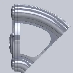
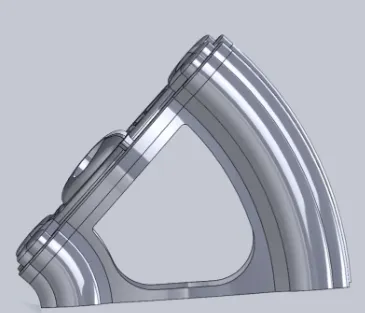
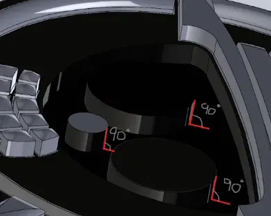
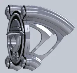
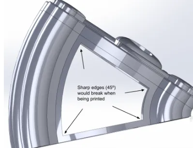
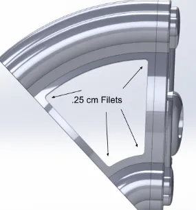
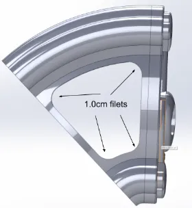
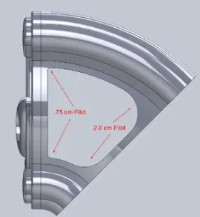
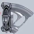
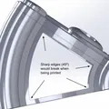
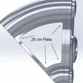
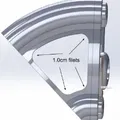
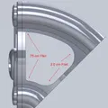
Our final design choice was to filet the inside corners of our base piece. Our first iteration of our base had 45° angles, which, like the eyes and nose in our first design choice, were prone to breaking off during printing, especially the unsupported bottom angles (see picture 24). So we decided to add some supports to the angles in the form of filets. Here are some iterations of the filet design (see pictures 25 and 26 ). We ultimately settled on the .75cm and 2.00cm filets because of the increased stability they had over our previous iterations, and because they looked more aesthetically pleasing (see picture 27). This design choice didn’t ultimately change much aesthetically about our print, but it added some much needed stability.
Giấy phép

File mô hình


Chưa có bản in nào được khoe. Hãy là người đầu tiên!

Chưa có bình luận nào. Hãy là người đầu tiên!